Last Updated on January 30, 2023 by Dee
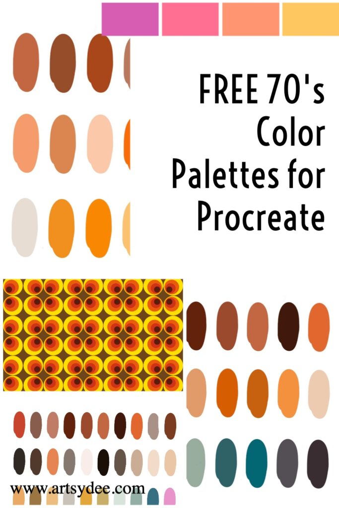
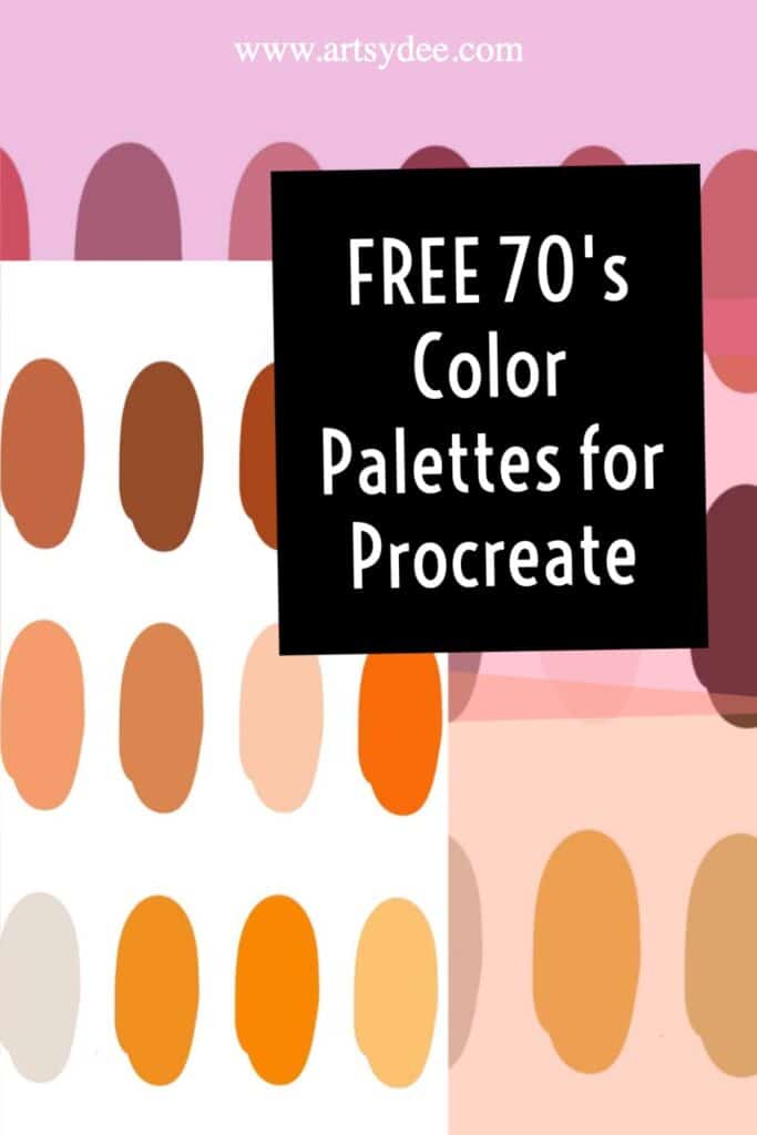
Do you want to add a touch of 70’s funkiness to your artwork? Grab these free color palettes that will help you do just that!
These palettes are perfect for Procreate and include a range of colors that will help you create vibrant 70’s-inspired designs. So what are you waiting for?
Get groovy with a free 70s color palette today 🙂
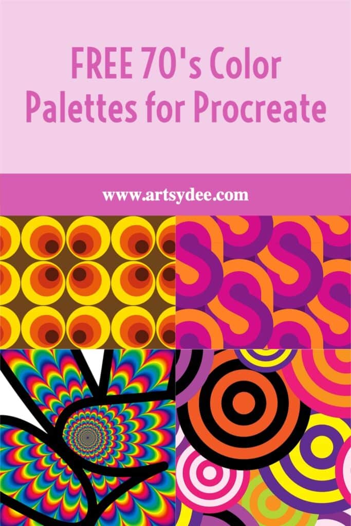
70’s Color Palettes for Procreate
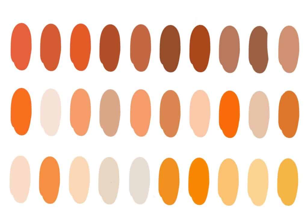
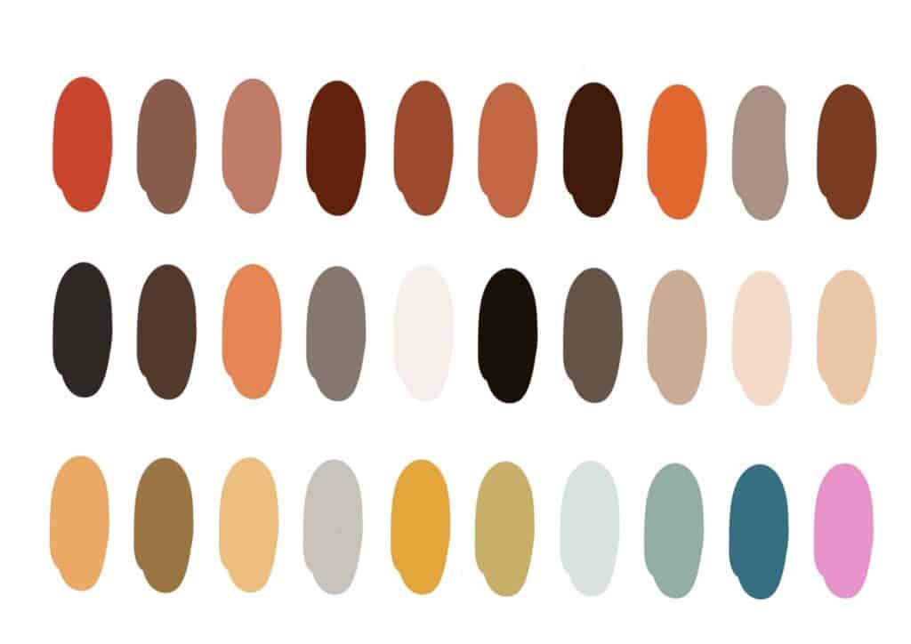
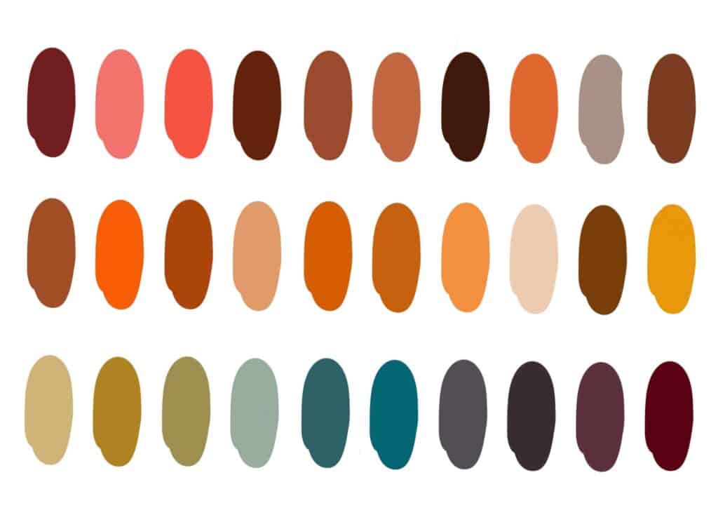
How to download the 70s Color Palette in Procreate.
Using your iPad, subscribe to the Artsydee newsletter below. You will be sent an email with a link to access these retro-style color swatches files.
Click on the link you receive in your email to access the swatches files. Once you have downloaded the palette, it will automatically save to your Procreate palettes and be ready for your next project!
For premium color palettes, check out my Etsy Store.
What are 70’s colors, and why are they so popular right now?
Right now, it seems like everyone is talking about 70’s colors.
From harvest gold, shades of brown, green, yellow, orange and earth tones to bright blues and even pink, these colors have been making a comeback in art, fashion, home décor, and everything in between.
But why are they so popular? Part of the reason may be that they evoke a sense of nostalgia.
For many people, the 70’s were a time of peace and love, and these colors can help to create that same feeling.
Additionally, they can add a fun and retro touch to any outfit or space.
Whether you’re looking to make a bold statement or want to add a pop of color, 70’s colors are the perfect way to do it.
So dust off those old bell bottoms and funky wallpaper and get ready to embrace the 70’s revival.
How to use 70’s Colors in your Artwork
The 1970s was a decade that saw various colors and patterns being used in all types of artwork and design.
From geometric shapes to floral prints, there was no shortage of bold and eye-catching designs.
However, many people gravitate towards more subtle and muted colors these days.
If you want to add a touch of 1970s flair to your work, there are a few ways to do it.
One option is to use a retro color palette, which typically includes bright oranges, yellows, greens, and pinks.
Another option is to incorporate patterns and prints that were popular in the 1970s, such as paisley or polka dots.
Or, you could even add some 1970s-inspired details, such as fringe or flared pants.
Whichever route you choose, adding a few elements from the 1970s is sure to give your work a unique and stylish edge.
What tools do you need to create 70’s-inspired Procreate designs with color palettes?
When it comes to creating 70’s-inspired Procreate designs, there are a few key tools that you’ll need in your digital arsenal.
First, you’ll need a color palette that captures the hues of the decade. Think warm oranges, browns, and yellows for a start.
You can find some great pre-made palettes online or create your own by experimenting with different colors.
Once you have your palette set, you’ll need to choose the right brushes to create your designs.
Thin lines and sharp edges will help to create a retro feel, so look for brushes that mimic the look of vintage comic books or design elements from the era.
With these tools in hand, you’ll be ready to create bold, beautiful Procreate designs that are perfect for any retro-loving client.
How will using 70’s colors affect the overall look and feel of your artwork or design project?
Colors from the 1970s can add a retro feel to your artwork or design project.
These colors can range from bold and bright to more muted and earthy tones.
Using these colors can give your project a sense of nostalgia or whimsy.
When using 1970s colors, it is important to consider your project’s overall tone and feel.
If you want to create a fun and fun design, you will want to use brighter, bolder colors.
If you are going for a more subdued and sophisticated look, you will want to use more muted and earthy tones.
Whatever look you are going for, using colors from the 1970s is sure to add some personality to your project.
Tips for using 70’s colors in your artwork
Keep a few things in mind when using 70s colors in your artwork or design projects.
First, consider the overall theme or feel of your project. The colors you use should help to create the desired mood or atmosphere.
Second, pay attention to the balance between light and dark colors. Using too much of one color can make your project look unbalanced and unfinished.
Finally, don’t be afraid to experiment! Try out different combinations of colors to see what works best for your particular project.
With a little effort, you can create something truly unique and eye-catching that will impress your friends, family, and clients.
Conclusion
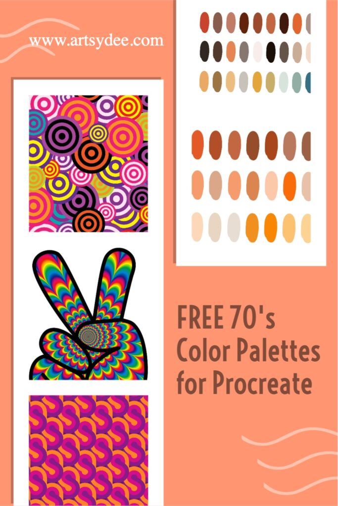
With these free 70’s color palettes, you can add a touch of funkiness to your artwork in Procreate. These Palettes are perfect for creating vibrant 70’s-inspired designs.
Check out my Etsy store for my Premium Palettes.
For more Procreate tips and creative inspiration, be sure to check out my YouTube channel 🙂
Other articles you may enjoy…
5 Free Skin Tone Collections | Skin Color Palette Procreate
18 Free Color Palettes for Procreate
How to color match in Procreate | 9 Easy Tips (2022)
How to Color in Procreate: The Ultimate Guide (2022)
21 Procreate Coloring Pages to Help You De-stress and Relax
The best iPad screen protectors for drawing in 2023
How to Make a Stamp in Procreate | Easy DIY Procreate Tips!
Looking for a Procreate Star Brush? 3 Free Procreate Star Stamps

