Pastel Palette Procreate: If you’re an artist or designer or simply love to create digital art, then you’re in for a treat. Procreate is one of the best digital illustration apps on the market, offering a wide range of tools and features that are perfect for artists of all levels.
One of the most popular features of Procreate is its vast library of color palettes, which includes a range of hues, shades, and tones to choose from. One particular type of palette that has taken the digital art world by storm is the pastel palette. With their soft, delicate, and dreamy hues, pastel colors have become a staple in digital art, graphic design, and illustration.
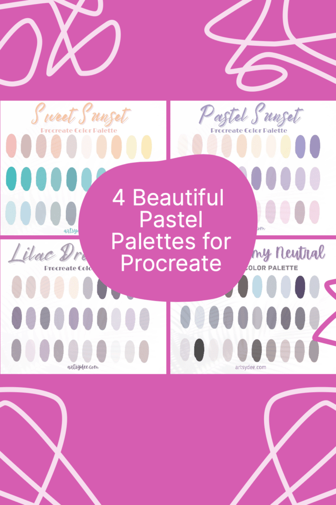
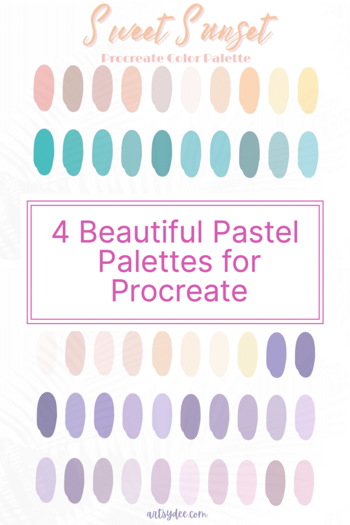
In this article, we’ll take a closer look at four stunning pastel palettes for Procreate: Sweet Sunset, Pastel Sunset, Mauve Creamy Neutral, and Lilac Winter.
We’ll show you how to use each palette and give you some tips and tricks to help you get the most out of them.
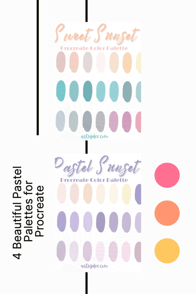
Pastel Palettes for Procreate
The Sweet Sunset Palette
Buy NowThe Sweet Sunset palette is a dreamy blend of soft pinks, peaches, and oranges, inspired by the colors of the sun as it sets over the horizon.
This light pastel color palette is perfect for creating art that evokes feelings of warmth, comfort, and happiness.
To use this Procreate color Palette, simply select the Colors tab from the toolbar and then tap on Palettes.
From there, you’ll be able to select the Sweet Sunset color palette and start using it in your art.
You can also save this color palette to your favorites so that you can easily access it in the future.
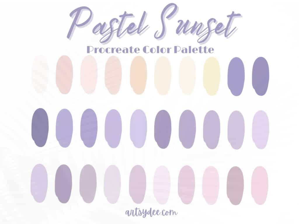
The Pastel Sunset Palette
Buy NowThe Pastel Sunset color palette is a softer and more muted version of the Sweet Sunset color palette, featuring gentle pinks, peaches, and oranges that are perfect for creating a dreamy and peaceful atmosphere.
Whether you’re working on a digital illustration or graphic design project or just doodling in your free time, the Pastel Sunset color palette is the perfect choice.
To use the Pastel Sunset palette in Procreate, simply select the Colors tab from the toolbar and then tap on Palettes.
From there, you’ll be able to select the Pastel Sunset color palette and start using it in your art.
Don’t forget to save it to your favorites so that you can easily access it in the future.
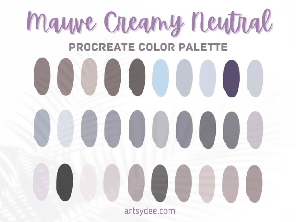
The Mauve Creamy Neutral Palette
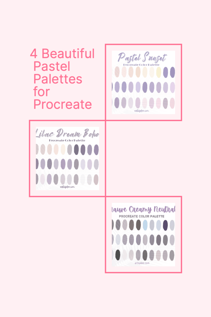
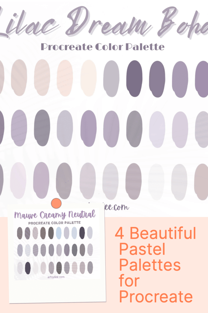
Buy NowThe Mauve Creamy Neutral palette is a soft and muted collection of mauve, pink, and neutral colors that are perfect for creating a warm and cozy atmosphere.
This palette is ideal for artists and designers who want to add a touch of elegance and sophistication to their work.
To use the Mauve Creamy Neutral palette in Procreate, simply select the Colors tab from the toolbar and then tap on Palettes.
From there, you’ll be able to select the Mauve Creamy Neutral palette and start using it in your art.
Be sure to save it to your favorites so that you can easily access it in the future.
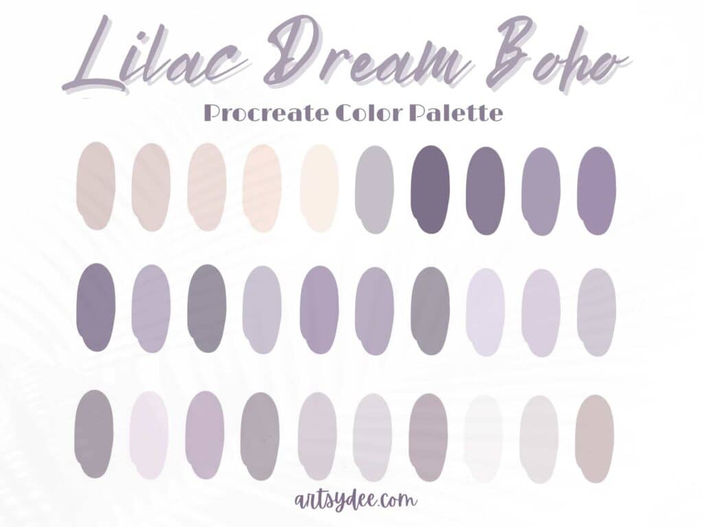
The Lilac Winter Palette
Buy NowThe Lilac Winter palette is a beautiful collection of soft lilac, blue cool tones, and pink colors that are perfect for creating a wintry and magical atmosphere.
Whether you’re working on a holiday-themed project or just want to add a touch of winter magic to your work, the Lilac Winter-curated color palette is a perfect choice.
To use the Lilac Winter palette in Procreate, simply select the Colors tab from the toolbar and then tap on Palettes.
From there, you’ll be able to select the Lilac Winter palette and start using it in your art. Don’t forget to save it to your favorites so that you can easily access it in the future.
How to get these color swatch files
While using your iPad, click on the link and purchase the color palette you want.
The color palette will then be available to download ( as color swatches), and then you can choose to open the swatches file in the Procreate app.
It will then be imported for you to use when creating artwork.
You can also save the palette in your favorites so that you can easily access it and use it for future creative projects.
How can pastel palettes be combined with other colors to create unique and exciting color schemes?
Pastel palettes can be combined with other colors in a variety of ways to create unique and exciting color schemes.
For example, you can pair pastels with bold, bright colors to create a contrasting look or with muted, earthy colors to create a harmonious look.
You can also combine them with warm and cool tones to create a gradient effect.
You can also use pastel shades as accent colors to add a pop of color to your design.
Experimenting with different color combinations will help you discover new and exciting ways to use pastel palettes in your work.
Finally, you can mix and match pastels with other shades to create unique and eye-catching combinations.
Experimentation is key when it comes to creating the perfect Procreate palette!
Adjust the saturation and brightness of pastel colors to create different moods and effects in your work
By adjusting the saturation and brightness of pastel colors, you can create different moods and effects in your work.
For example, increasing the saturation of a pastel color will make it more vibrant and eye-catching, while decreasing the saturation will make it more muted and subdued.
Adjusting the brightness of a pastel color will also affect its mood – making it brighter will create a cheerful, optimistic mood, while making it darker will create a more serious, sophisticated mood.
Tips for using pastel palettes effectively in your design projects
When using pastel palettes in your design projects, there are a few tips to keep in mind to ensure that your work is effective and appealing.
Firstly, make sure to choose colors that are appropriate for your project and audience. Secondly, use pastel colors sparingly and strategically to create a balance between softness and boldness.
Thirdly, consider using pastel colors as background colors or accent colors rather than as the main colors in your design.
Finally, experiment with different pastel color combinations to find the perfect palette for your project. By following these tips, you can use pastel palettes effectively in your design projects and create beautiful, engaging, and memorable work.
Frequently Asked Questions about Pastel Palettes Procreate
How do I get free palettes in Procreate?
Grab my 18 Free Procreate Color Palettes.
How do I get more color palettes in Procreate?
To get more color palettes in Procreate, you can create your own color palettes, or to save time, purchase already-made color palettes online.
How do you make a pastel palette?
To make a pastel palette, start by selecting a base color that you’d like to use as the main hue.
Then, add lighter and darker shades of that color to your palette to create a range of tones.
You can also add complementary colors to your palette to create a more balanced and harmonious look.
How do you get a palette in Canva?
To get a palette in Canva, simply select the Colors tab from the left-hand menu and then tap on Palettes.
From there, you’ll be able to access a wide range of color palettes, including pastel options.
Where can I get free color palettes?
Grab my 18 Free Color Palettes HERE.
What is the hex code for pastel colors?
The hex code for pastel colors varies depending on the specific shade. To find the hex code for a particular color, you can use a color picker tool like Adobe Color or Color Hex.
Conclusion
Pastel palettes for Procreate are a beautiful and versatile way to add soft, dreamy, and magical hues to your digital art, graphic design, and illustration projects. Whether you’re using Procreate or another digital art app, we hope this article has inspired you to explore the world of pastel palettes. Happy creating!
Other articles you may enjoy…
5 Free Skin Tone Collections | Skin Color Palette Procreate
18 Free Color Palettes for Procreate
Boho Color Palette Procreate (8 Beautiful Color Schemes)
Get Groovy with a Procreate 70s Color Palette
